Sheer: Tutorial Level Mockups
The game should not include any direct instructions onscreen, such as text prompting the player what to do. You can use numbers or symbols if desired.
A tough restriction, but a good one. A well-designed game can carefully shape what the player attempts. The recent Superliminal for example is an absolute masterclass in leading the player to the correct actions, while convincing the player that they weren't assisted in any way and that everything was entirely their own idea. I should probably write a short piece on Superliminal at some point.
For Sheer, I need to teach the player how use a non-standard control scheme for movement, how to pick up sections, rotate them in the plane of the screen, change their 'depth' relative to other objects, and place them to create pathways. And I need to do all that without using any explicit instructions or text. If possible, I'd like to avoid symbols too.
I hold that the player should only be uncertain of one thing at a time. If they don't know what their goal is, then what they are expected to do should be obvious: the player completes these actions and discovers the goal. If the player doesn't know how to use the tools at their disposal, they should at least have an obvious goal to work towards. Here, the player doesn't know the controls, which means that until they learn them, I should make obvious both their goal and the necessary steps to achieve it. If the player can see what they need to do, their only task is working out how to do it.
This should give the player a clear purpose. The next step is ensuring that whatever the player thinks is the most obvious thing to try, is successful. So, what will a player attempt?
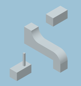
Top left: my mockup for the first tutorial puzzle. The player is the thin stick, and progress upwards and rightwards follows standard conventions, so the player should intuitively understand that they are trying to move in this direction. There is a floating piece of pathway, obviously the right size and shape to bridge the gap, and from the positioning the player can immediately see that they need to move it downwards. This is a PC game, so click-and-drag is likely the first thing the player will try, and so they will learn how to move sections.
In the second puzzle, the situation is the same, but the player needs to rotate the section before it will bridge the gap. Again, the method and the goal are obvious, so the player knows they need to work out the controls for rotation. They're now familiar with M1+drag to select and move sections, so (I think) M2 should be the next thing most players will try. Anecdotally, it seems most people visualise shapes rotating around the axes along which these objects are built, rather than in the axes of their screen. That's not the case here – following the idea that the perspective of the game is reality, objects and faces do not rotate out of sight: instead they rotate 120° in the plane of the screen (below). The direction of rotation may not be what the player expects, but it results in success and the player learns how rotation works.
In the third introductory puzzle, the player must again rotate a section to bridge the gap. Rotation is always clockwise, and this section must be rotated twice to fit, reinforcing how rotation works. This level also introduces the player to curves, which change which face the player is walking on. After rotating the section, the player can walk across/up it.
After these introductory levels, the player should understand the controls, the rules of the game world, and be equipped to handle simple puzzles.
Above: the same section, rotated


